I am so excited to share with you a couple of blog posts about my recent workshop at the Stitchin' Post in Sisters. You all know I'm a huge Christina Cameli fan ... totally love her book First Steps to Free Motion Quilting. I thoroughly enjoyed every minute of the workshop in Sisters ... what a treat to teach at one of my most favorite places on planet earth. I have taken so many classes at the Stitchin' Post over the years ... I totally teared up when I was introduced! Truly, it means the world to me to have been asked to teach there and hopefully return some of the goodness that has been so generously shared with me by a multitude of fantastic teachers.
You can read about the workshop and see pics on the Stitchin' Post blog. Kristin, one of my awesome students and a new friend, also posted about the workshop on her blog. Kristin, a very talented quilt maker, just taught a journal cover class at the Stitchin' Post. Not only did she make a quilted zipper bag and fabric bucket, she quilted an improv quilt in class. Yea Kristin! Be sure and check out her work!

Monday, November 17, 2014
Saturday, April 19, 2014
Fabric buckets are FUN ... seriously!
I'm happily making samples for upcoming classes and am having a seriously great time making fabric buckets for my Modern Machine Quilting class that starts later this month. The class includes four projects from Christina Cameli's fabulous book First Steps to Free-Motion Quilting:

Christina blogs at A Few Scraps ... go check it out. She just made a messenger bag using Jennifer Sampou's new Shimmer fabric collection ... drool.
Before you look at the fabric buckets ... warning warning warning ... they are addictive! Fun and so easy to make ... and I can take no credit whatsoever; I simply followed Christina's excellent instructions.
The fabric bucket on top and to the right were quilted with free motion designs but the fabric at bottom left was quilted with a decorative stitch and a walking foot ... easy as can be!
I want to make gobs and gobs ... to organize socks, scarves, gloves and in my sewing room, the fabric buckets are ideal for zippers and trims. One of my students thought up this idea: line with a laminate for a pot of flowers. And of course they are a perfect gift container for a quilter ... just fill with a pattern and some fat quarters!
Here, one of the buckets is filled with the diamonds and triangles I cut to make a Night Sky quilt (pattern by Julie Herman, Jaybird Quilts):
Thank you Christina!
Happy Easter weekend everyone and thank you for stopping by.
PS ... I am now hooked on fabric buckets ... you too? You might enjoy my Pinterest board of fabric buckets, bowls and baskets.
Christina blogs at A Few Scraps ... go check it out. She just made a messenger bag using Jennifer Sampou's new Shimmer fabric collection ... drool.
Before you look at the fabric buckets ... warning warning warning ... they are addictive! Fun and so easy to make ... and I can take no credit whatsoever; I simply followed Christina's excellent instructions.
 |
| Fabric Buckets |
I want to make gobs and gobs ... to organize socks, scarves, gloves and in my sewing room, the fabric buckets are ideal for zippers and trims. One of my students thought up this idea: line with a laminate for a pot of flowers. And of course they are a perfect gift container for a quilter ... just fill with a pattern and some fat quarters!
Here, one of the buckets is filled with the diamonds and triangles I cut to make a Night Sky quilt (pattern by Julie Herman, Jaybird Quilts):
 |
| Fabric Bucket full of patches ready to sew |
Happy Easter weekend everyone and thank you for stopping by.
PS ... I am now hooked on fabric buckets ... you too? You might enjoy my Pinterest board of fabric buckets, bowls and baskets.
Sunday, January 19, 2014
Tula Pink BoM First 25 Blocks
I can hardly wait to see next week's installment of modern blocks as well as launch a third class who will begin planning their quilts. Meanwhile, I have an update on our work in progress. Linda D surprised everyone last month! Not only did she bring 20+ beautiful new blocks, she started over with a completely different group of fabrics ... zombies!
I am in love with that occasional touch of red ...
Next up is Sherry W ... her modern blocks feature her collection of Australian prints.
What a gorgeous palette ... and those tiny dots add such sparkle to her quilt!

Auditioning a possible background fabric ...

Instead of one large quilt, some are making two smaller quilts with their blocks.
Next up are several collections of bright and happy quilts in the making.
Karlee designed an original "pair of diamonds" block for her quilt (bottom right) ... yea!
Charlotte and Heather are working with grays for their modern quilts.
Lana and Lynn are working with a softer palette. Lana is planning to lay out her quilt so the predominantly yellow blocks form a diagonal across the center of her quilt then blend to pale gray and aqua in the upper left corner and darker teal and charcoal in the bottom right corner ... great idea!
I hope you enjoy their thoughtful, beautiful work!
 |
| Linda D's Modern Blocks |
I am in love with that occasional touch of red ...
 |
| Zombies ... what fun! |
 |
| Visually striking fussy cutting |
 |
| Sherry W's Modern Blocks |
What a gorgeous palette ... and those tiny dots add such sparkle to her quilt!

Auditioning a possible background fabric ...

Instead of one large quilt, some are making two smaller quilts with their blocks.
 |
| Mallory J's Blocks in Brights |
 |
| Mallory J's Taupe Blocks |
 |
| Kathy A's Modern Blocks ... Brights and Desert Southwest Palettes |
Next up are several collections of bright and happy quilts in the making.
 |
| Carolyn B's Modern Blocks |
 |
| Pam G's Modern Blocks |
 |
| Detail of Pam G's Blocks |
 |
| Karen B's Modern Blocks |
Karlee designed an original "pair of diamonds" block for her quilt (bottom right) ... yea!
 |
| Karlee S' Modern Blocks |
 |
| Kathy S' Modern Blocks |
 |
| Charlotte W's Modern Blocks |
 |
| Heather J's Modern Blocks |
 |
| Lana's Modern Blocks |
 |
| Lynn's Modern Blocks |
Monday, January 13, 2014
Angels & Antics in the Winter Snow
Happy New Year! To kick off Quilts & Paws in 2014, I send all of you my best wishes for a happy, healthy, fulfilling year. Here in the Willamette Valley, early December 2013 brought heavy snow followed by a week of frigid temps. To give an idea just how much snow, here's one of the feeders we diligently kept full for our birds and squirrels.
Our house in the trees looks its best while the snow is still pristine with most of the weeds and yard chores hidden from view.


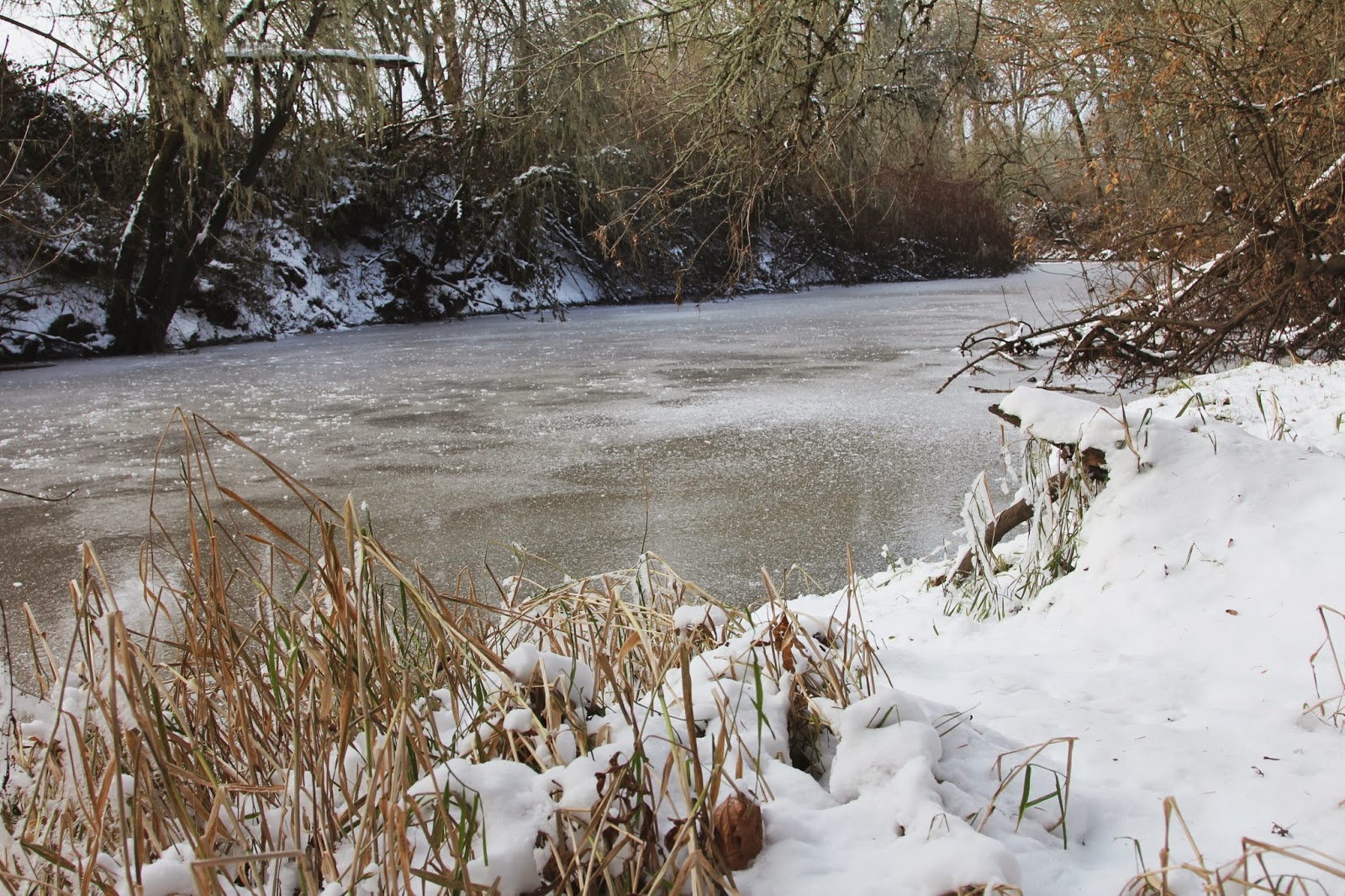
Just how cold was it? A week of bitterly cold temps from the teens all the way down to zero left the creek in our back yard frozen over ... the only time that has occurred in the 16+ years we've lived here. But trust me, I didn't test it to see how thick the ice was!
No one enjoys snow more than our two goldens ... they both absolutely love it! Frankie likes to eat snow, catch snowballs, romp and roll. Even though he's 11 years old, I think he still has a sweet baby face.
For Nickel, who will be 3 years old this spring, this was his very first snow. It was fluffy, powdery snow that wouldn't pack into a snowball so we had to make do with the Kong toys.
Another pic of Frankie's sweet face ...
The canine world seemingly has no concept of "one for you, one for me" ... there is only ever one desirable toy at least so far as Nickel is concerned. Frankie, gentle soul that he is, rarely contests the possession of a toy. Nickel, however, is ever vigilant ... constantly keeping on eye on Frankie's interests.
I mentioned that Frankie loves to roll in the snow; he demonstrated the proper way to make a snow angel for the inexperienced Nickel.
Just as we started to head in the house because I was freezing, our neighbor John who lives to the south of us, started doing something very interesting in his yard. Notice that Nickel has commandeered both toys.
... followed a moment later by several sharp "bangs" as one of our neighbors to the north decided the snow inspired a little back yard target practice ...an alert to the north in perfect unison.
What fun!
 |
| An 8-inch snowfall is rare in the Willamette Valley |
Our house in the trees looks its best while the snow is still pristine with most of the weeds and yard chores hidden from view.


Just how cold was it? A week of bitterly cold temps from the teens all the way down to zero left the creek in our back yard frozen over ... the only time that has occurred in the 16+ years we've lived here. But trust me, I didn't test it to see how thick the ice was!
 |
| Frozen Muddy Creek |
No one enjoys snow more than our two goldens ... they both absolutely love it! Frankie likes to eat snow, catch snowballs, romp and roll. Even though he's 11 years old, I think he still has a sweet baby face.
 |
| Frankie is ready for a snowball |
For Nickel, who will be 3 years old this spring, this was his very first snow. It was fluffy, powdery snow that wouldn't pack into a snowball so we had to make do with the Kong toys.
 |
| Nickel's very first snow |
Another pic of Frankie's sweet face ...
 |
| Hi there |
The canine world seemingly has no concept of "one for you, one for me" ... there is only ever one desirable toy at least so far as Nickel is concerned. Frankie, gentle soul that he is, rarely contests the possession of a toy. Nickel, however, is ever vigilant ... constantly keeping on eye on Frankie's interests.
 |
| His toy is better than my toy? |
I mentioned that Frankie loves to roll in the snow; he demonstrated the proper way to make a snow angel for the inexperienced Nickel.
 |
| A snow angel tutorial |
 |
| That felt great! |
 |
| Alert to the south! |
... followed a moment later by several sharp "bangs" as one of our neighbors to the north decided the snow inspired a little back yard target practice ...an alert to the north in perfect unison.
 |
| Alert to the north! |
What fun!
Wednesday, December 4, 2013
Tula Pink BoM First 15 Blocks
I am thoroughly enjoying the making of Tula Pink's City Sampler blocks. It is delightful fun to pick fabrics, cut and sew the modern 6" blocks! Starting in October, two groups at the Pine Needle embarked on this journey together and a third class will start in February. In the first class, we discussed quilt sizes and layouts, then planned preliminary color placement before we jumped in and started sewing. I am so excited about these quilts and can hardly stand the wait from month to month to see what everyone has made.
Here are some of the fabulous blocks my students have made, starting with a happy, colorful palette of fabrics by Jan C ... and please let me know if I don't have the correct person associated with her work!
Here is a detail so you can see how she features an especially pretty print in many of her blocks:
Next up are the blocks of Karlee S ... I love the way she is combining Tula Pink's Acacia and Denyse Schmidt's Florence fabrics!
Charlotte W chose a subtle, monochromatic palette of grays, creams and golds ... with a surprising hint of aqua that sets off her blocks beautifully.
Here is a detail photo of Charlotte's blocks ... I love the purse in the center as well as the clever way she used a stripe to frame the center flower in the block on the left.
Donna B is also working in a subtle, monochromatic palette ... with a touch of green in the form of hand dyed damask. The black and white graphic prints give her blocks such drama!
Lynn B chose a tranquil blue, teal and green palette, a color scheme she fell instantly in love with the moment she saw the fabrics at the Pine Needle. As we work, we are all continuing to find new fabrics to add to our collections for our City Sampler quilts. Thankfully, we have a playground of 100 blocks!
Pansies are Pam G's favorite flower ... so is the perfect feature fabric for her quilt. Pam is also asking others to select the fabrics for a block and is naming the block for that person ... great idea! Pam is also using some vibrant, colorful silks in her blocks.
Kathy A plans to make two lap-sized quilts with her blocks. One will be inspired by the colors of the desert Southwest but shown here are the blocks she will use in her quilt inspired by a flower garden. The interesting twist Kathy plans is a thunderstorm looming over the garden ... I can't wait to see!
Here is another delightfully happy palette of fabrics selected by Linda D who plans to set her blocks on point. Isn't it smart to put the blocks on the design wall on point as well? The black and white prints in her blocks are magic!

Here is another subtle, calm palette of soft aqua, gray and yellow ... and a touch of green. Lana K's blocks feature a beautiful floral print and bird print from Dear Stella's Paloma collection. Aren't her blocks lovely?
Heather J loves large scale graphic prints and has chosen a palette of grays, whites and yellows. I am eager to see more and will do my best to take more photos from our next classes.
Here is another bright, happy palette of blocks by Carolyn B who wants to "get modern" with her quilting ... I think she's got it! Carolyn is doing a great job with her vibrant, rich colors and dynamic prints.
Peggy FY is working in her favorite colors ... rainbow brights! After quite a bit of experimentation, Peggy decided to add black and white prints which I think are making her blocks sing!
Kathy S fell in love with the Astrid collection by Erin McMorris ... along with solids, black and white prints and one of my favorite Art Gallery prints, Squared Elements. These are happy, bright and energetic.
Lou Ann T loves to work in red, yellow and blue, her favorite color palette. I think working with the three primary colors can be quite challenging but Lou Ann has clearly mastered it.
Sherry coordinated a variety of prints and solid fabrics with a beautiful Australian print. I love the spiral of white dots in the Australian print and that lime green and orange stripe is perfect! Sherry plans to make two lap-sized quilts. It turns out that the group of coordinating fabrics works great with two different Australian prints.
Finally, here are my blocks. I decided to work in a limited palette of reds, oranges and yellows and am pushing that palette as far as I can. I am working mostly in solids with a few "low volume" prints for drama. Have you heard fabrics described as low volume? These are prints that use a small number of colors ... red and white, red and orange, yellow and white for example.
I hope you are enjoying these blocks!
Here are some of the fabulous blocks my students have made, starting with a happy, colorful palette of fabrics by Jan C ... and please let me know if I don't have the correct person associated with her work!
 |
| Jan C's City Sampler Blocks |
Here is a detail so you can see how she features an especially pretty print in many of her blocks:
 |
| Jan C's Blocks, detail |
Next up are the blocks of Karlee S ... I love the way she is combining Tula Pink's Acacia and Denyse Schmidt's Florence fabrics!
 |
| Karlee S' City Sampler Blocks |
Charlotte W chose a subtle, monochromatic palette of grays, creams and golds ... with a surprising hint of aqua that sets off her blocks beautifully.
 |
| Charlotte W's City Sampler Blocks |
Here is a detail photo of Charlotte's blocks ... I love the purse in the center as well as the clever way she used a stripe to frame the center flower in the block on the left.
 |
| Charlotte W's blocks, detail |
Donna B is also working in a subtle, monochromatic palette ... with a touch of green in the form of hand dyed damask. The black and white graphic prints give her blocks such drama!
 |
| Donna B's City Sampler Blocks |
Lynn B chose a tranquil blue, teal and green palette, a color scheme she fell instantly in love with the moment she saw the fabrics at the Pine Needle. As we work, we are all continuing to find new fabrics to add to our collections for our City Sampler quilts. Thankfully, we have a playground of 100 blocks!
 |
| Lynn B's City Sampler Blocks |
Pansies are Pam G's favorite flower ... so is the perfect feature fabric for her quilt. Pam is also asking others to select the fabrics for a block and is naming the block for that person ... great idea! Pam is also using some vibrant, colorful silks in her blocks.
 |
| Pam G's City Sampler Blocks |
Kathy A plans to make two lap-sized quilts with her blocks. One will be inspired by the colors of the desert Southwest but shown here are the blocks she will use in her quilt inspired by a flower garden. The interesting twist Kathy plans is a thunderstorm looming over the garden ... I can't wait to see!
 |
| Kathy A's City Sampler Blocks |
Here is another delightfully happy palette of fabrics selected by Linda D who plans to set her blocks on point. Isn't it smart to put the blocks on the design wall on point as well? The black and white prints in her blocks are magic!

Here is another subtle, calm palette of soft aqua, gray and yellow ... and a touch of green. Lana K's blocks feature a beautiful floral print and bird print from Dear Stella's Paloma collection. Aren't her blocks lovely?
 |
| Lana K's City Sampler Blocks |
Heather J loves large scale graphic prints and has chosen a palette of grays, whites and yellows. I am eager to see more and will do my best to take more photos from our next classes.
 |
| Heather J's City Sampler Blocks |
Here is another bright, happy palette of blocks by Carolyn B who wants to "get modern" with her quilting ... I think she's got it! Carolyn is doing a great job with her vibrant, rich colors and dynamic prints.
 |
| Carolyn B's City Sampler Blocks |
Peggy FY is working in her favorite colors ... rainbow brights! After quite a bit of experimentation, Peggy decided to add black and white prints which I think are making her blocks sing!
 |
| Peggy FY's City Sampler Blocks |
Kathy S fell in love with the Astrid collection by Erin McMorris ... along with solids, black and white prints and one of my favorite Art Gallery prints, Squared Elements. These are happy, bright and energetic.
 |
| Kathy S' City Sampler Blocks |
Lou Ann T loves to work in red, yellow and blue, her favorite color palette. I think working with the three primary colors can be quite challenging but Lou Ann has clearly mastered it.
 |
| Lou Ann T's City Sampler Blocks |
Sherry coordinated a variety of prints and solid fabrics with a beautiful Australian print. I love the spiral of white dots in the Australian print and that lime green and orange stripe is perfect! Sherry plans to make two lap-sized quilts. It turns out that the group of coordinating fabrics works great with two different Australian prints.
 |
| Sherry W's City Sampler Blocks |
Finally, here are my blocks. I decided to work in a limited palette of reds, oranges and yellows and am pushing that palette as far as I can. I am working mostly in solids with a few "low volume" prints for drama. Have you heard fabrics described as low volume? These are prints that use a small number of colors ... red and white, red and orange, yellow and white for example.
 |
| Pam's City Sampler Blocks |
I hope you are enjoying these blocks!
Subscribe to:
Posts (Atom)